CLIPS Devlog #3: UI
Introduction
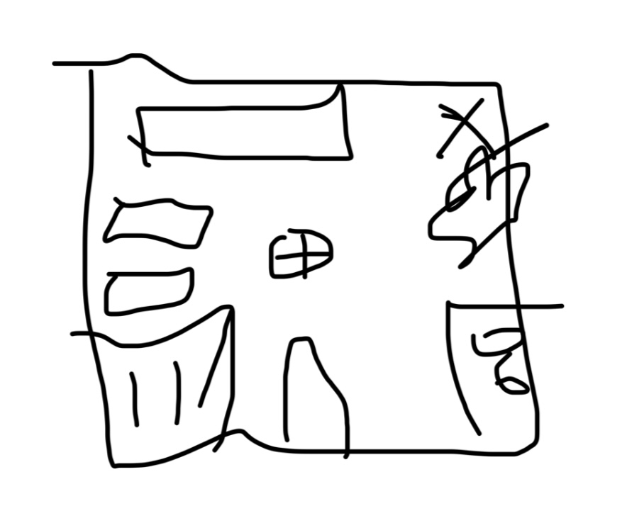
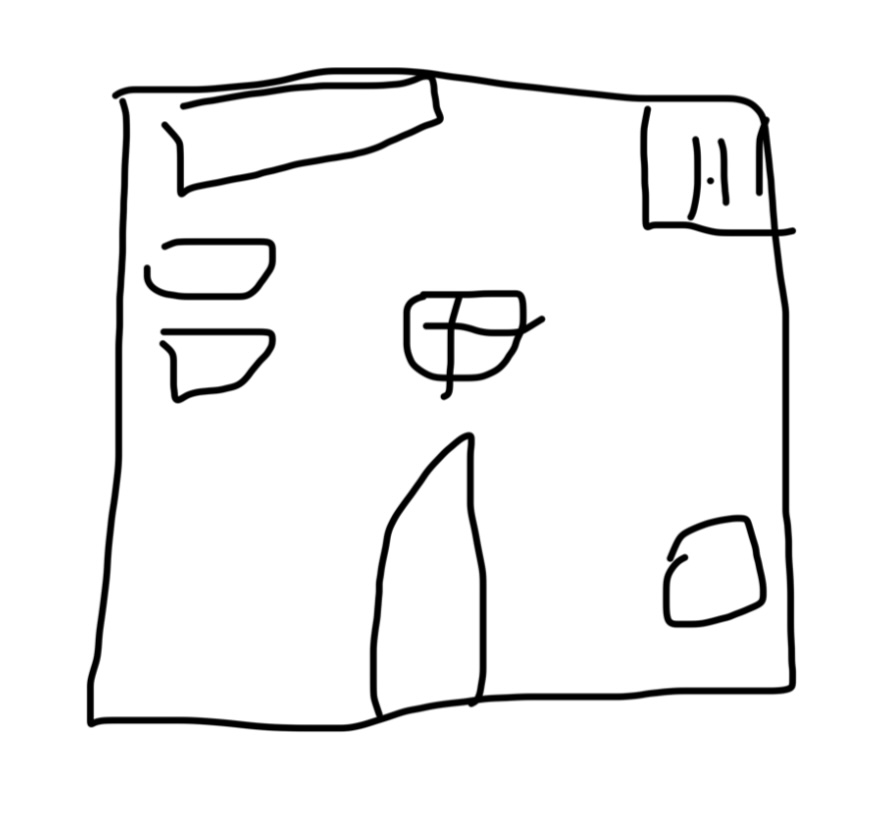
User Interface, or UI is a key part of games. Whether it is a game menu or HUD found in game, UI has existed since the early days of gaming. Thus, UI can make or break a game. Too much UI can crowd the screen, and too little will leave the player confused. Here, I will talk about how I created a balance of the screen and UI.
(Crowded UI)
(Clean UI)
CLIPS UI Elements
For this game, there are some UI parts I will need:
- An area for spoken text and text that describes the object the player is hovering over.
- Arrows to turn around.
- A map and inventory button.
- A settings and menu button.
- A way to save and quit.
Options
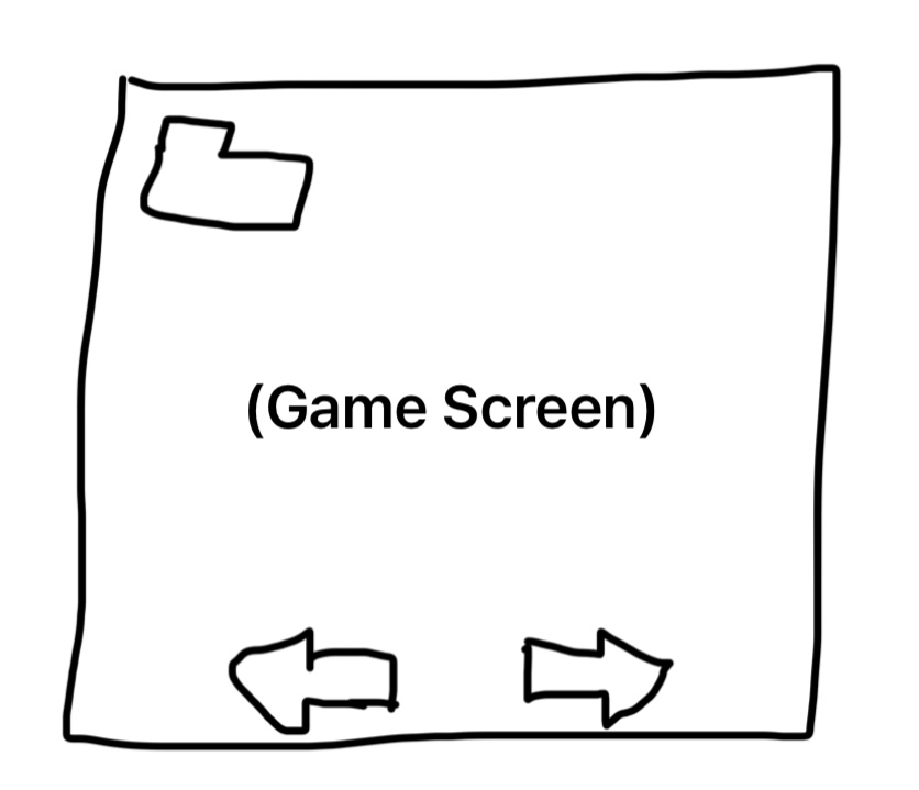
There are two things I can do to fix this UI issue. I can either give the player a way to customize the UI, or have menus that pop up with many buttons, activated by a single button press. I chose the second option. This is because the map and inventory can be grouped with the menu, save, and quit options for better optimization. This is a rough sketch of the final UI:
Under the file button, a pop-up screen will appear with the inventory and map, along with all the other options. And that is my take on (and solution too) UI crowding, I hope this may also help you in your games!
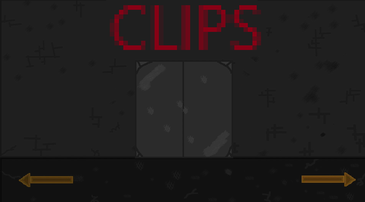
CLIPS
An upcoming point-and-click escape room horror game!
| Status | On hold |
| Author | Snow140 |
| Genre | Puzzle |
| Tags | 2D, Escape Game, First-Person, Horror |
More posts
- Development Paused!Nov 04, 2024
- CLIPS Devlog #9 - LoreOct 02, 2024
- CLIPS Devlog #8: Learning GodotSep 21, 2024
- CLIPS Devlog #7 - Game Engines (Part two)Aug 31, 2024
- CLIPS Devlog #6: Game EnginesAug 17, 2024
- CLIPS Progress Update #1Jul 24, 2024
- CLIPS Devlog #5: PuzzlesJul 23, 2024
- CLIPS Devlog #4: ProgressionJul 13, 2024
- CLIPS Devlog #2: Limits of a Point-and-ClickJul 11, 2024


Leave a comment
Log in with itch.io to leave a comment.